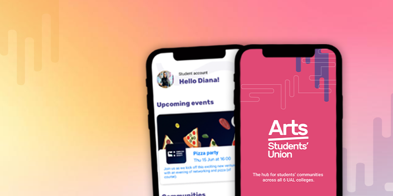
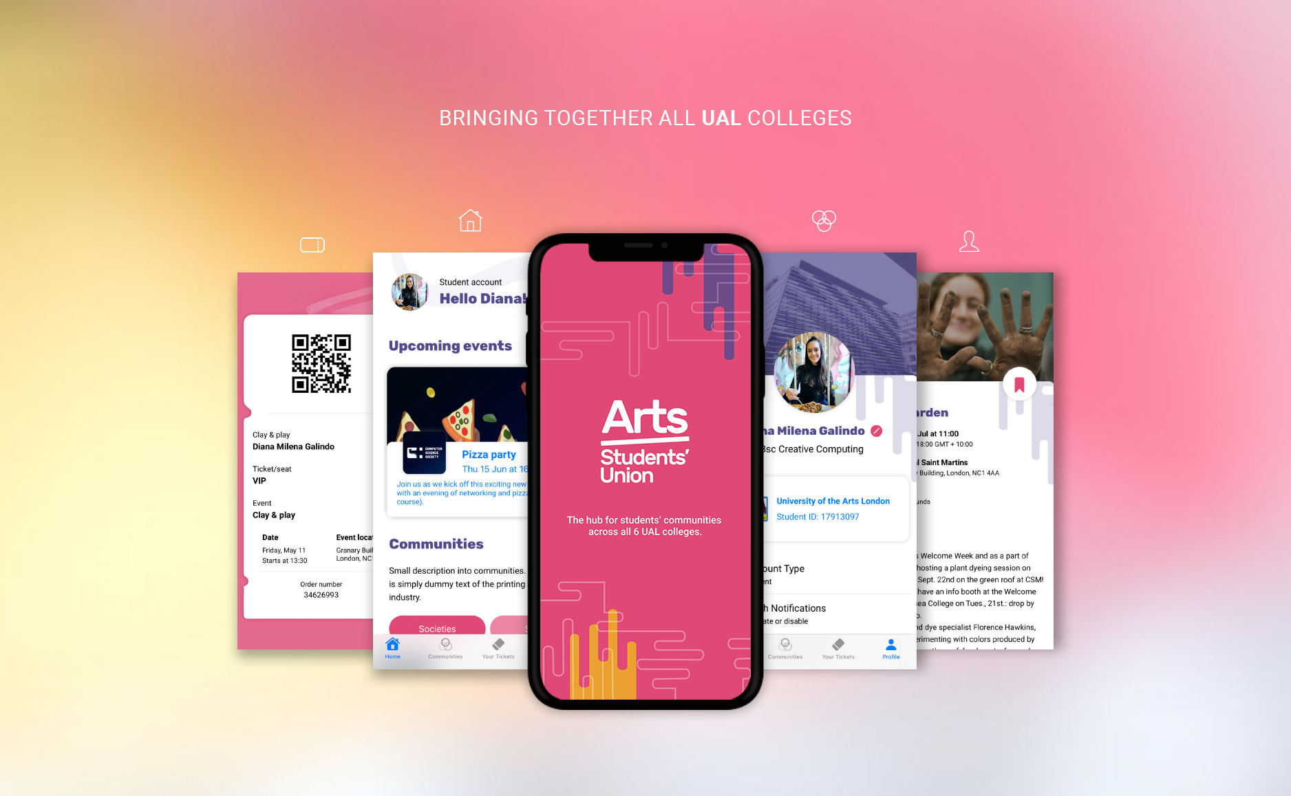
Arts Student Union
Year: 2023
Type: App Design
Core Skills:
UX design UI design SwiftUI Figma User research WireframingProject Objective
The following project explores the development of a mobile app for the Arts Student Union.
Starting from the concept of ‘community as sentiment’ (Simpson, 1937) rather than merely ‘locality’ (Clark, 1973),
the application brings together a community that can live online and offline. The application pretends to meet the
innate human need for belonging and significance, allowing students to connect with each other through communities
where they share interests.
This app caters to two main users: The student who wants to be part of a community (either a society or sports club),
and the student committee member, who is responsible for running a community within the Student Union.
The Problem
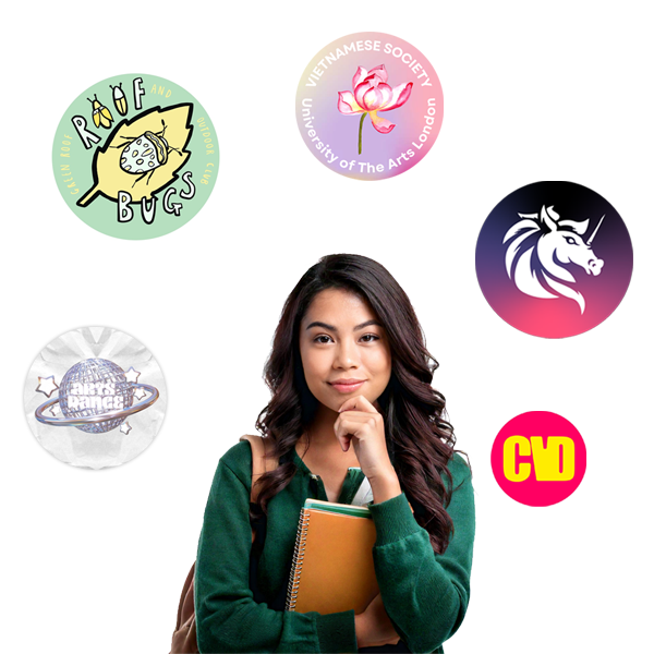
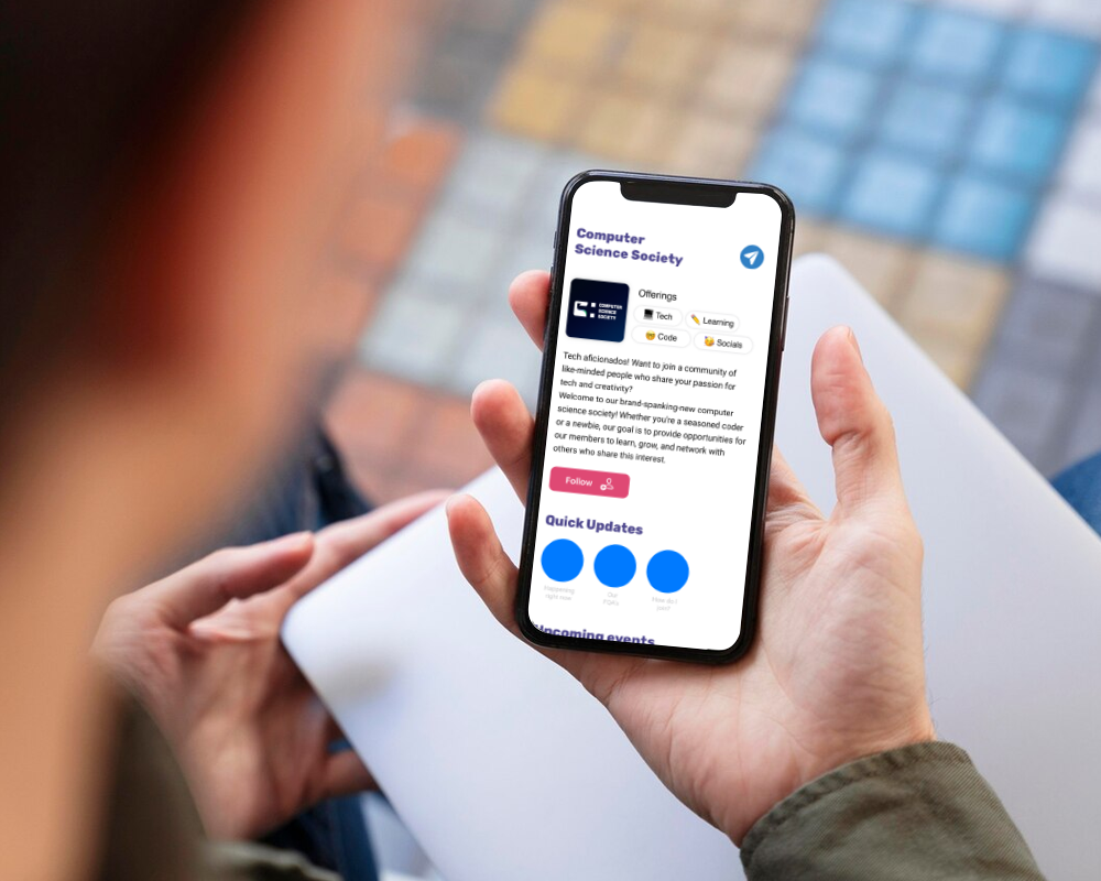
During the process of creating the Computer Science Society at the University of Arts London, our committee realised how broad and disjointed the sports clubs and Societies felt in the online realm. Every society seemed to have its own Instagram account, and other communication channels, while the process of managing a society felt daunting, with different forms that needed to be completed and sent over email, such as budget Excel documents, health and safety word documents, training sessions, etc.
Therefore, the aim of creating the Student Union app is to house all these different areas under a unified platform, allowing the creation and management of societies, as well as facilitating communication with members. This app is therefore built as a platform where UAl students can find out all about the communities they can be part of, create and manage their own, and speed up communication and procedures with the Student Union.

Research
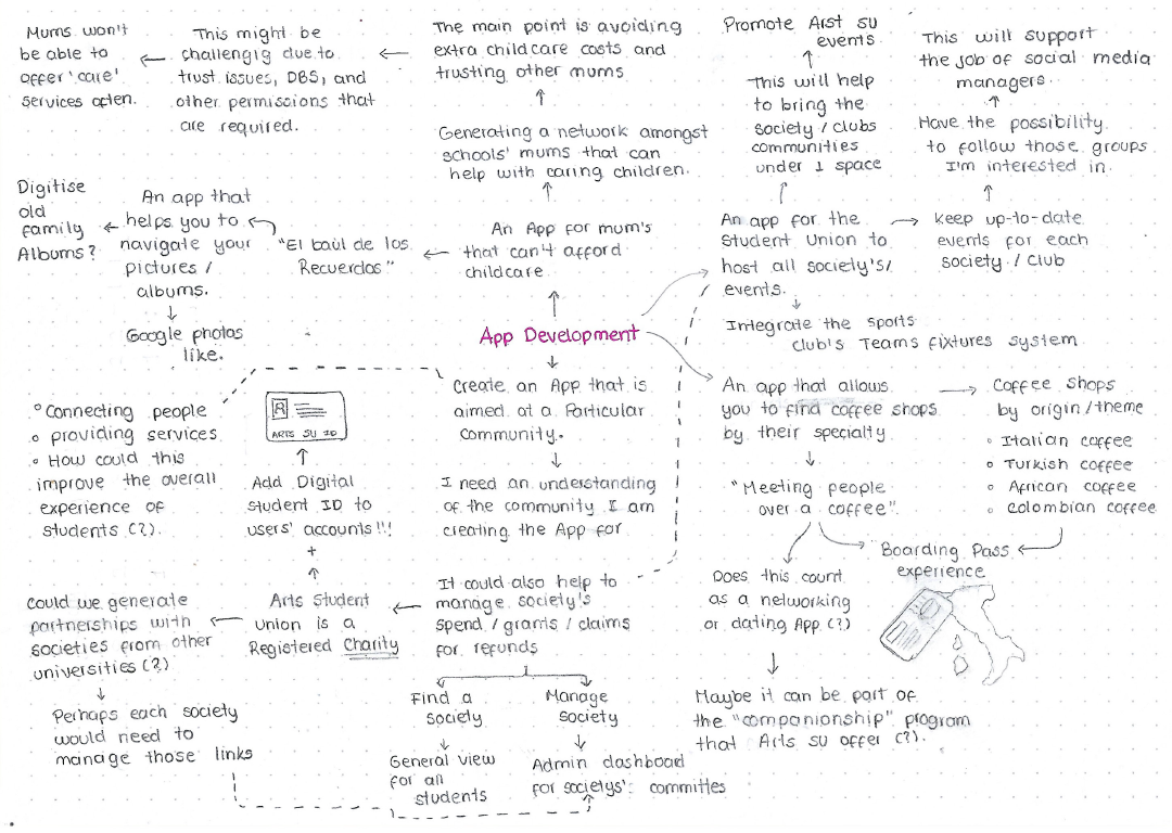
Brainstorming mind map
The main brief for the App development unit gravitated around the creation of an app aimed at a particular community, whilst being critical of the concept of community. We were also prompted to focus on researching the needs and habits of the chosen community, as well as design, prototype and iterate. I explored different app ideas, ranging from an app for parents who can’t afford childcare, to an app that helps people meet new individuals over coffee.
In the end, I chose to talk about students, and the student union, since I was going through the process of opening a new society along with the committee members. Additionally, I was part of the volleyball society, which operated under a separate app dedicated only to sports, making me realise how disjointed the communication channels and management of societies and sports clubs were.
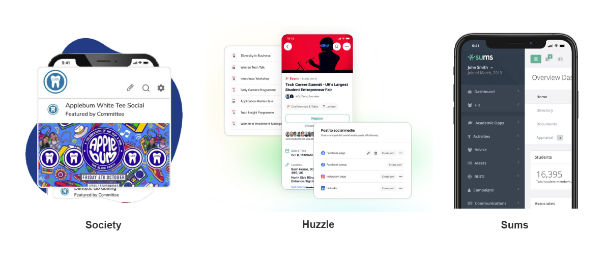
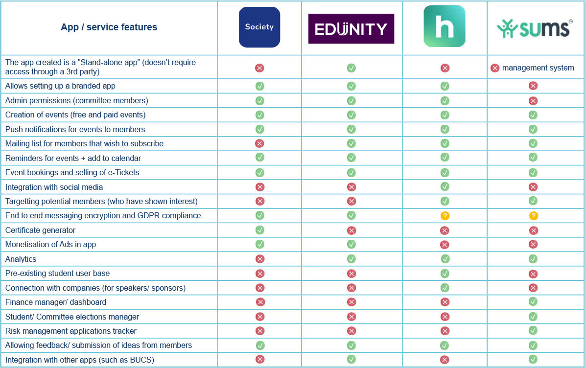
Competitor Research
Looking at other existing apps created to manage societies was incredibly useful for understanding the main features available in the market and the design elements that each one of them brings to the table. I researched the ‘Society’, ‘Edunity’, ‘Huzzle’, and ‘Sums’ apps, extracting the main features for each, their availability on app stores, examples of their interfaces, and their differentiation propositions. To summarise this detailed research, I created a table that compares the main features across these apps.
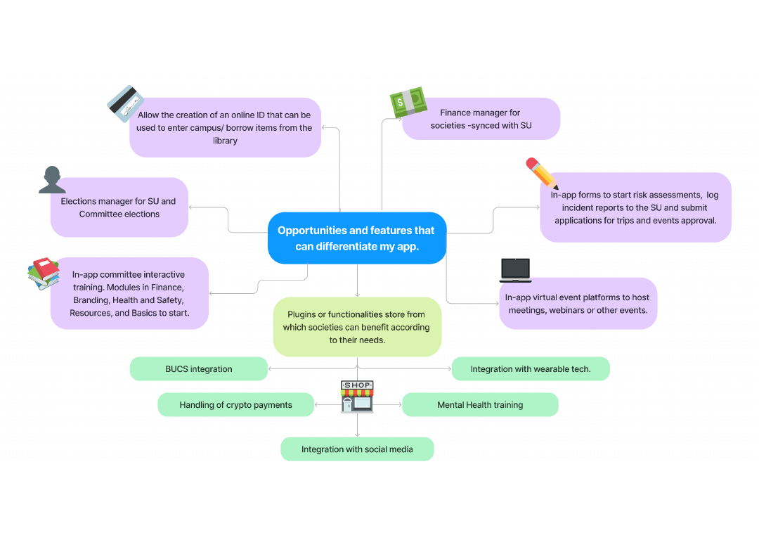
Opportunities
How can my app differentiate from the competitors? From the research, I was able to identify ‘must-have’ features for societies and sports club apps. Many of them focus on engagement, events management, and in-app ticket purchases. While some apps exploit the reach that social media offers, some others consider them noise and a distraction to the user. There’s also the idea of monetisation of ads to bring in funds from sponsors, and a real concern to communicate the app’s commitment with GDPR and privacy.
There are opportunities to improve the management of the communities and improve the communication between Student Union and Societies/ Sports clubs, which have been summarised in the following mind map:
Development
Moodboard
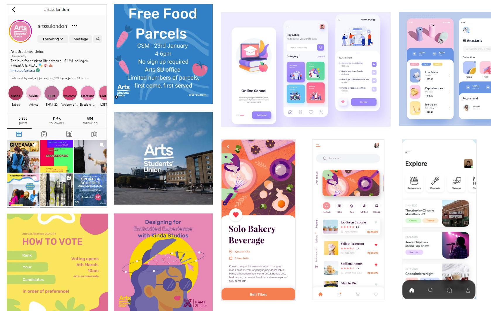
to be able to come up with a look and feel (brand guidelines) for the app, I explored the SU communication channels, such as their Instagram and website. From this observation, I was able to extract logos, fonts, colours, and other design elements that contribute to brand consistency. However, I also explored other app’s information layouts, buttons, use of colour and use of imagery, as possible inspiration.
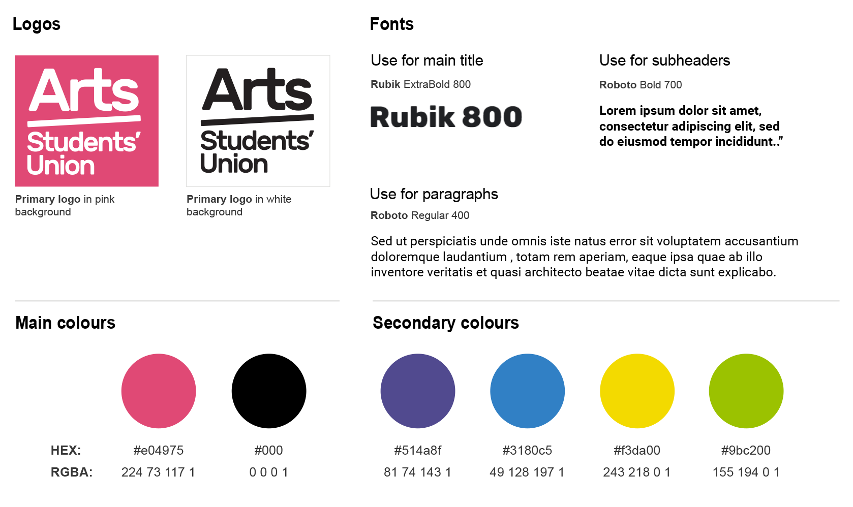
App Brand Style Guidelines
Extracting the existing use of colours and fonts from the Arts Students’ Union, I created a set of guidelines that would inform the creation of a high-fidelity prototype later in the development process. These guidelines were key to generating visual cohesion and coherence on every screen of the app.
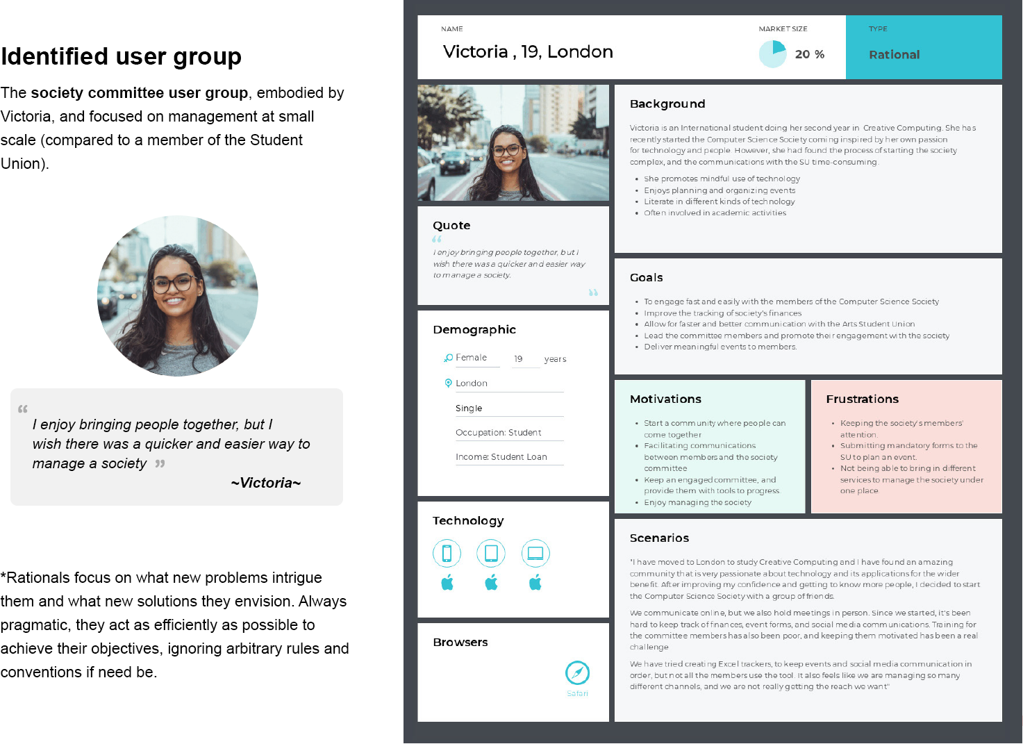
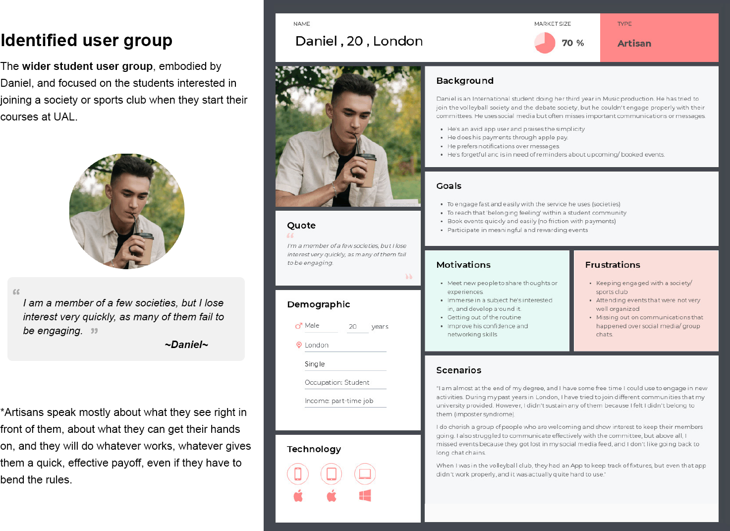
The users
The Arts Students’ Union App has two potential users. Victoria embodies society committee members who require a platform to manage their societies and/or sports clubs. Daniel embodies a wider student group: those who are interested in joining a society. The following personas explore demographic traits, as well as motivations, frustrations, goals, and scenarios.
Flowchart
This flowchart describes the overview of different interactions that a user can have within the app. Planning the app at its functionality level was useful for mapping the different ‘Swift Views’ and programmatic components required for the app to work. You can explore the Flowchart in full through the link below.
View flowchart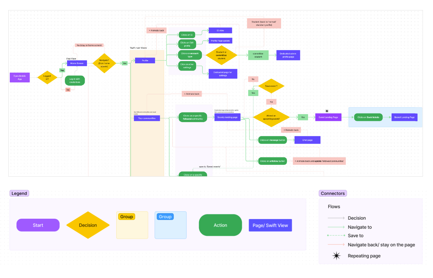
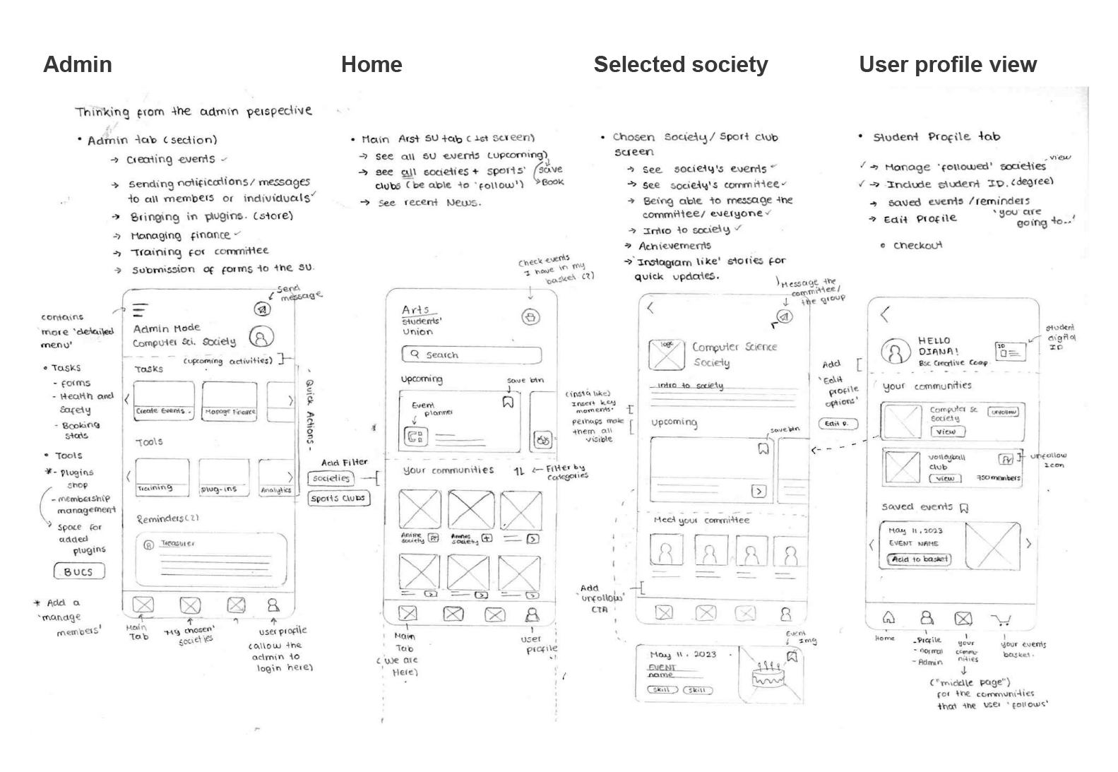
Low Fidelity App wireframe
After having a rough initial idea of the required screens, I created a quick wireframe along with the different components and interactions. This low-fidelity wireframe explores different layouts, icons, and possible interactions. Each screen is accompanied by notes explaining the main goal of a certain element, or questions on whether that element is needed or could be explored differently.
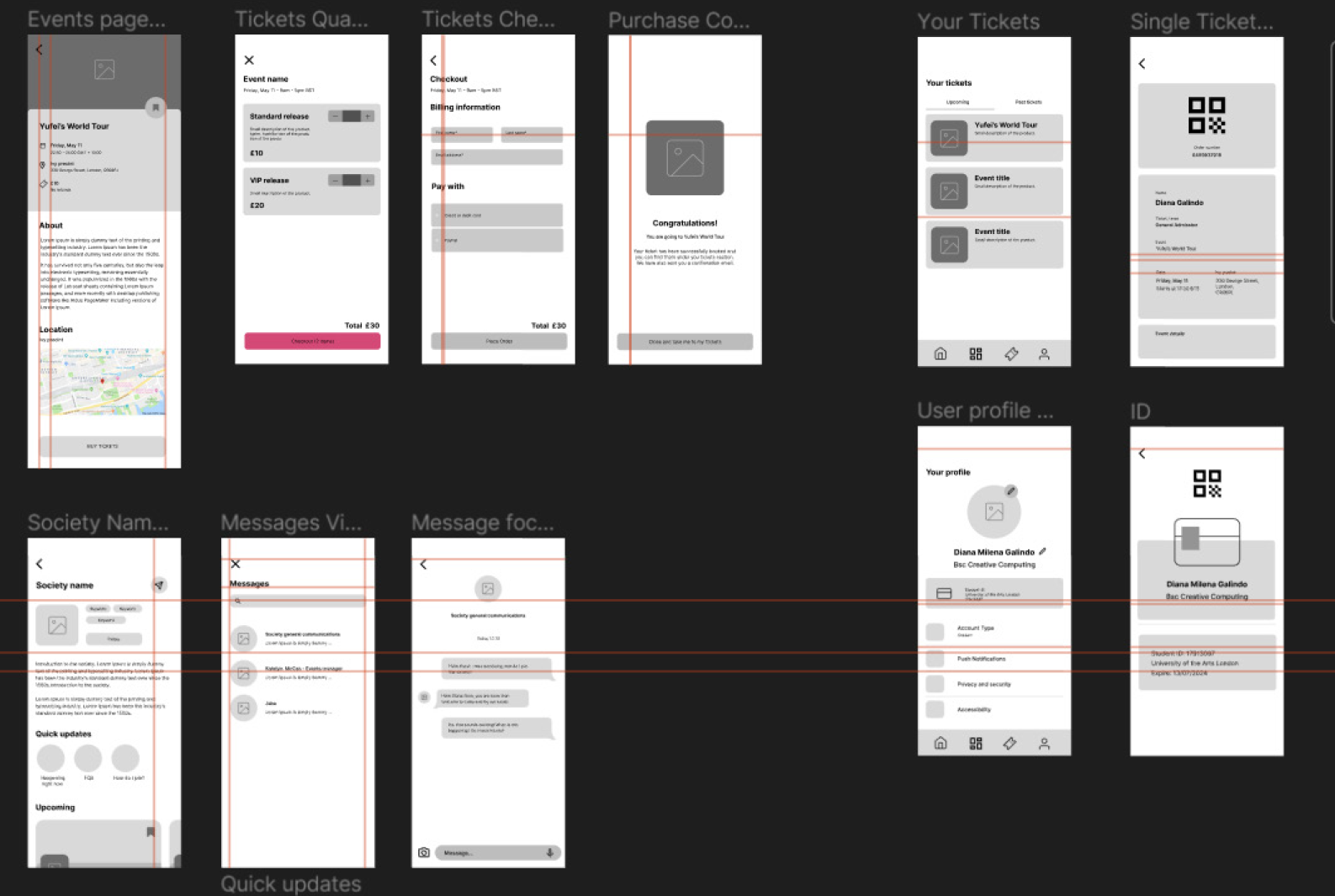
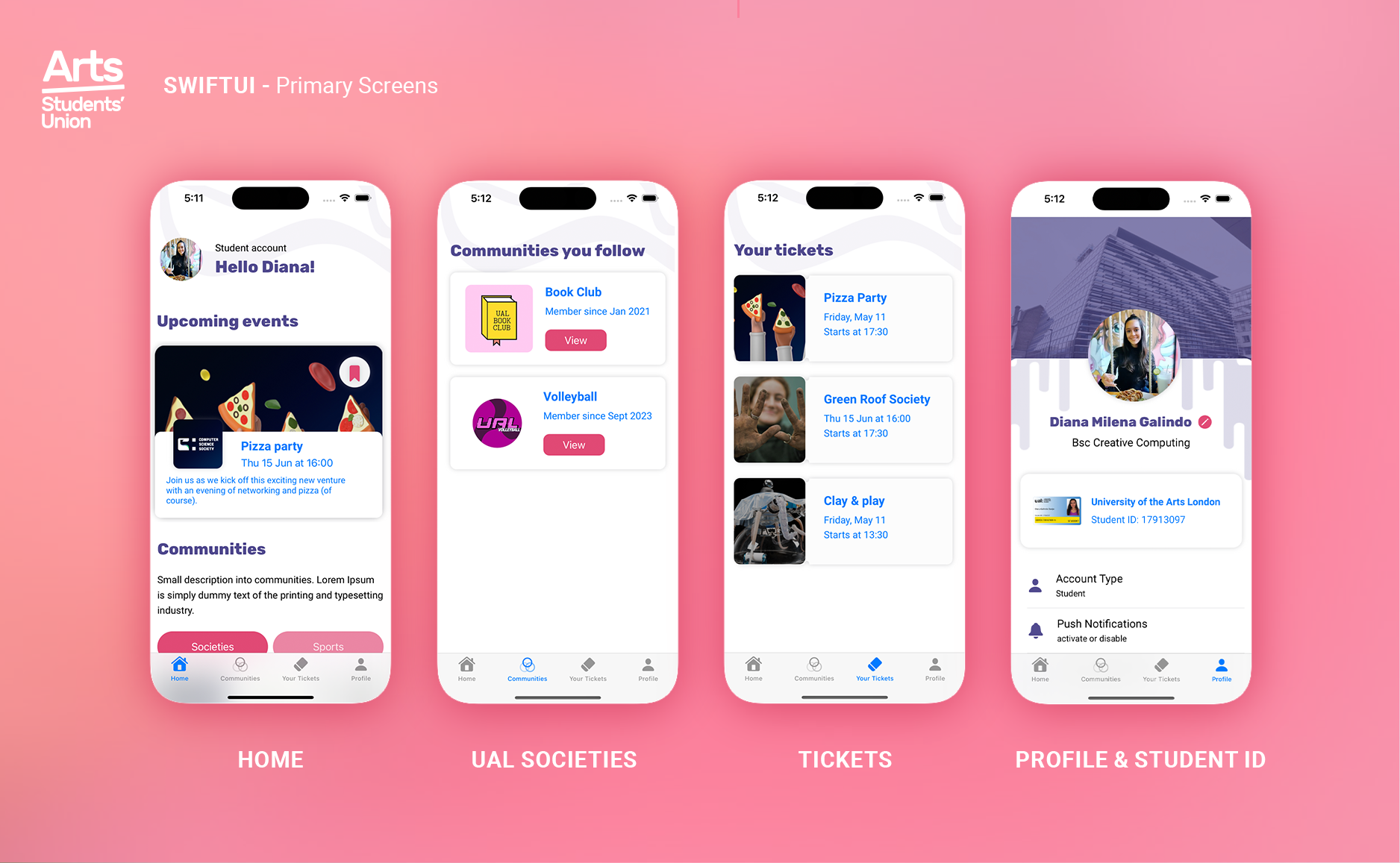
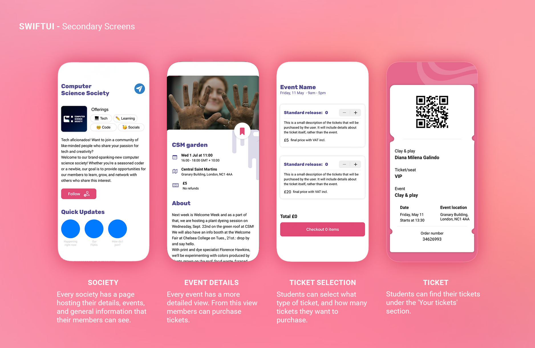
Figma Prototypes
The following prototypes intend to show the desired interaction between screens, as well as incorporate the brand guidelines in the actual design of the app. These prototypes were key to understanding the different functionalities that needed to be coded in SwiftUI, and how I could make certain components modular in the coding process. The High-fidelity prototype also focuses on making a clear distinction in the user journey between those students who manage a society (committee members) versus those students who are only members.
 Low-fidelity prototype
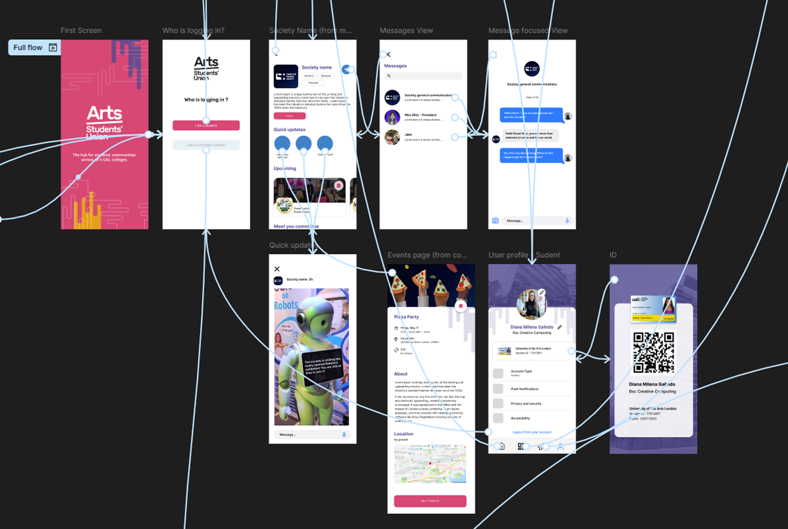
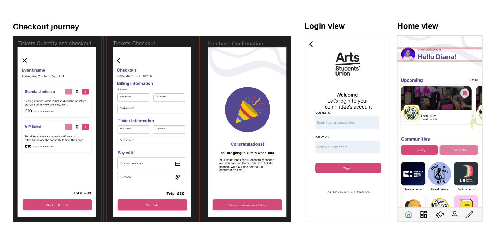
 High-fidelity prototype
Design Considerations
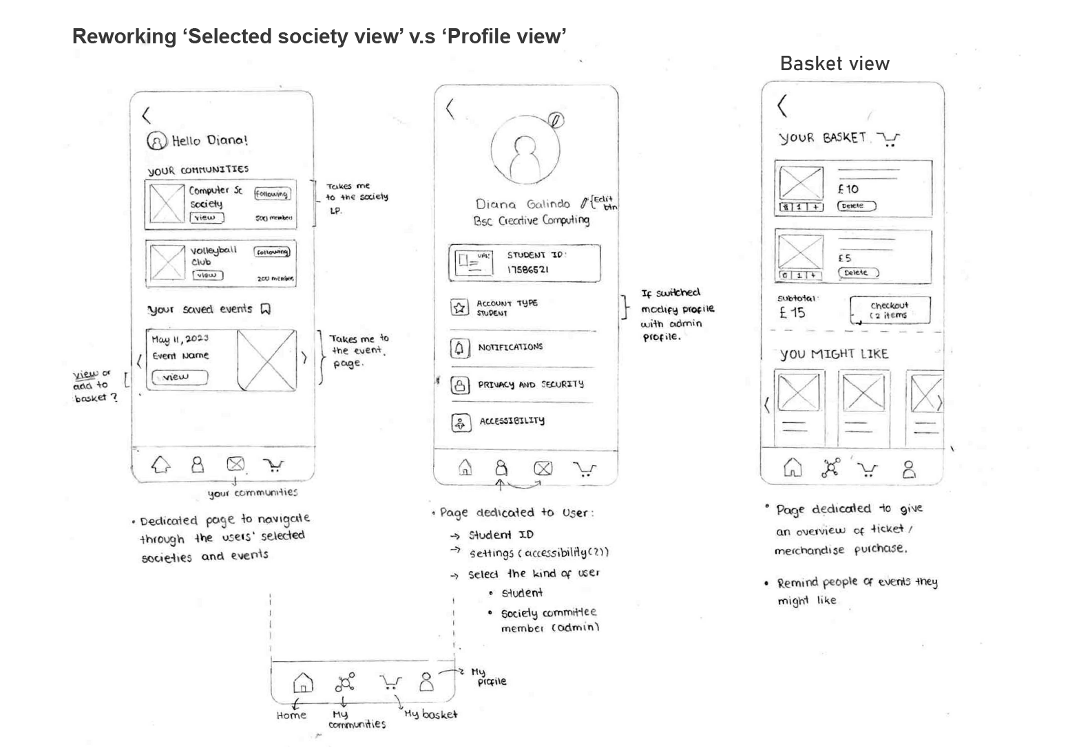
Reworking “My basket” View
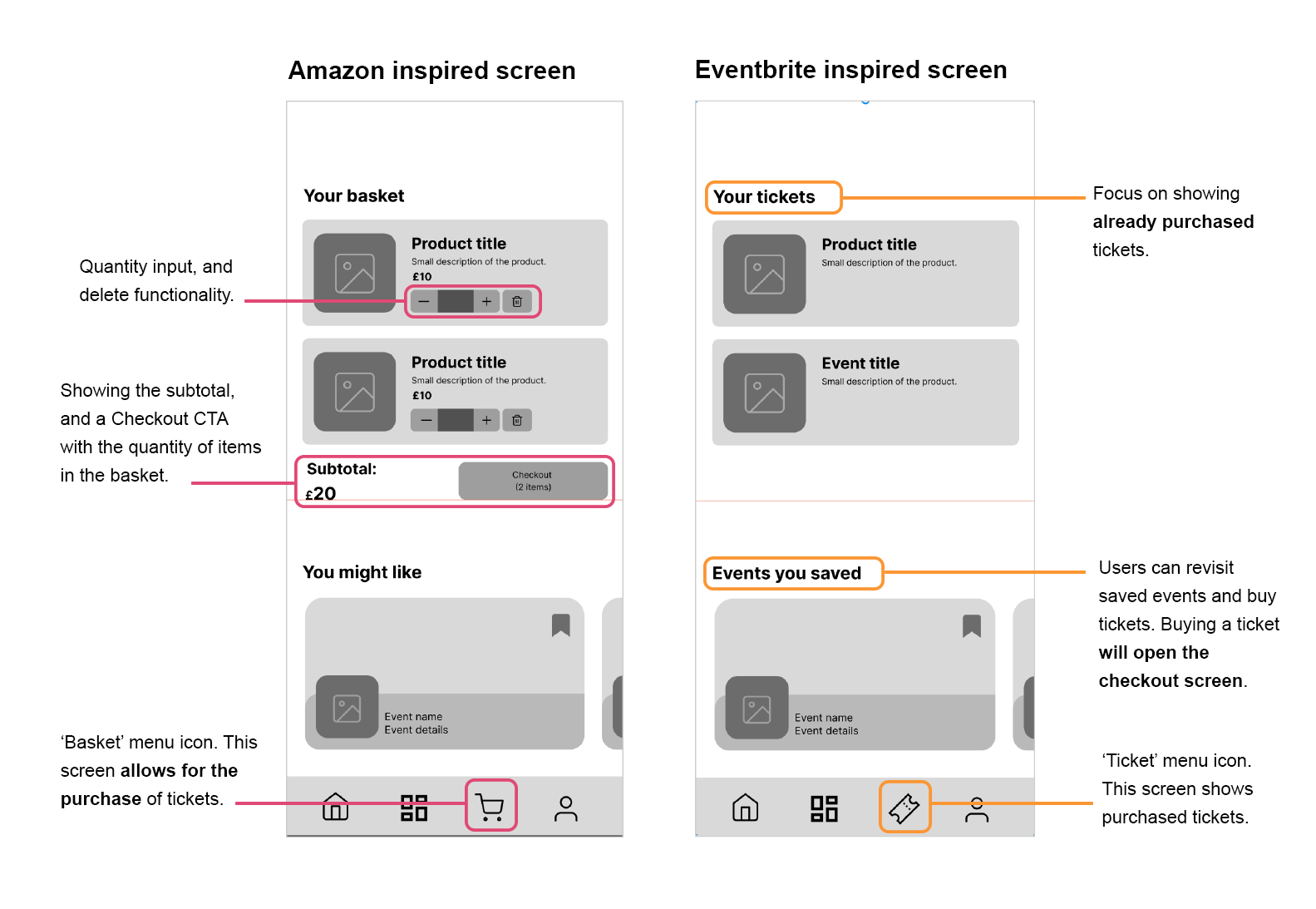
- The ‘my basket’ section was initially designed as a place to host tickets that were not purchased on the spot, suggest events that might be relevant to the user, and allow user checkout. Later, this screen changed to show the already purchased tickets, making it easier for user to show their tickets at events.
- The first screen was inspired by Amazon’s checkout page, whilst the second screen was inspired by Eventbrite, which brings out the real purpose of the tickets feature.
Moving the 'my basket' view
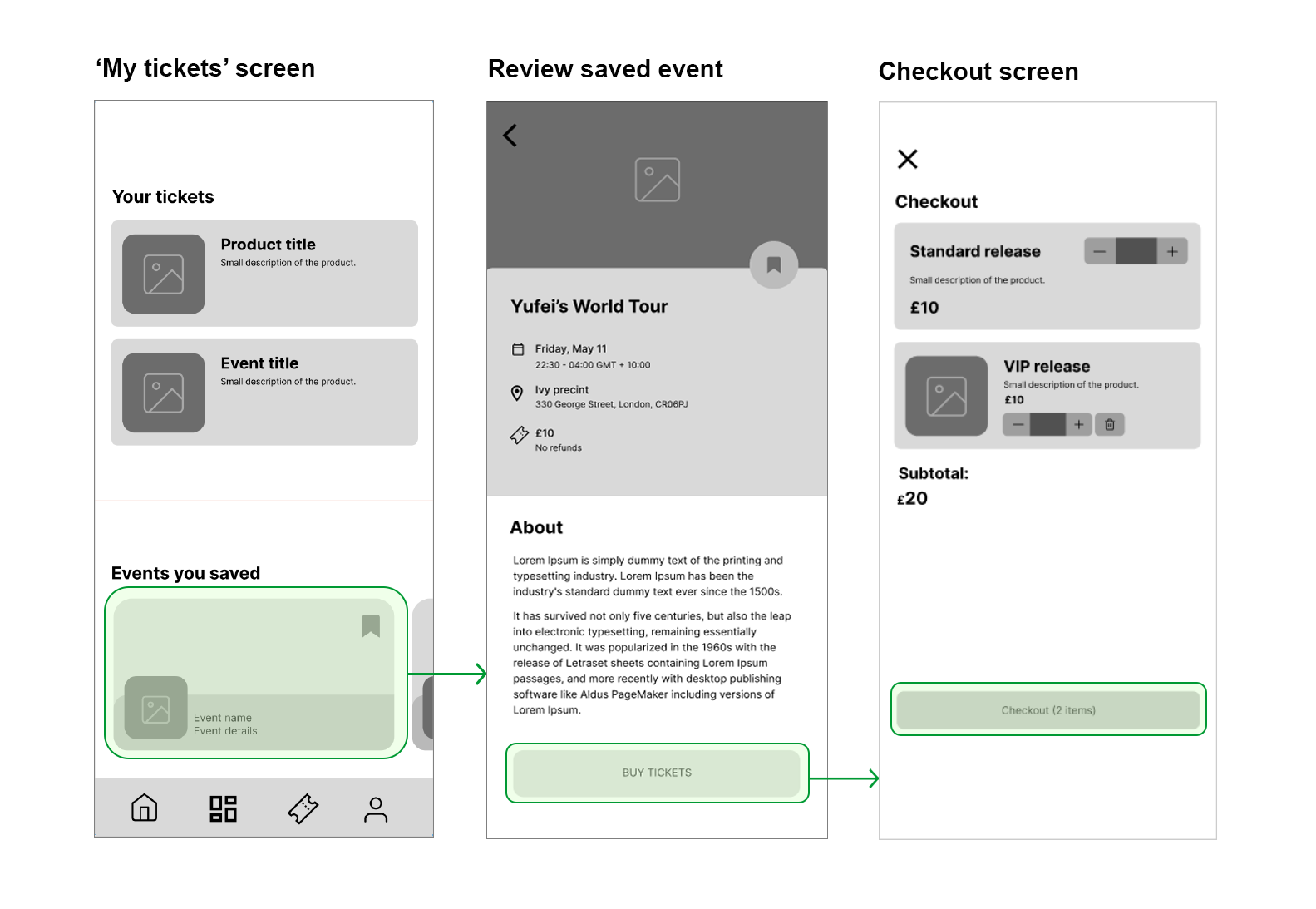
The checkout process was moved from the main Ticket screen, where the main purpose is to find purchased tickets. Instead, the checkout process is active when the user is seeking to buy tickets, and it will allow them to select the type of tickets, the quantity, and then pay.
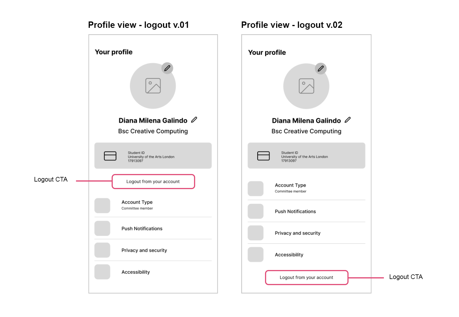
Logout from account
To log out from their account, users are required to navigate to their profile and initiate the log-out process from there. Placing the log-out button below the Student ID poses a potential risk, as users may inadvertently log out while attempting to access their ID. This is precisely why the decision was made to position the logout button at the bottom of the screen.
Navigation menu according to account type
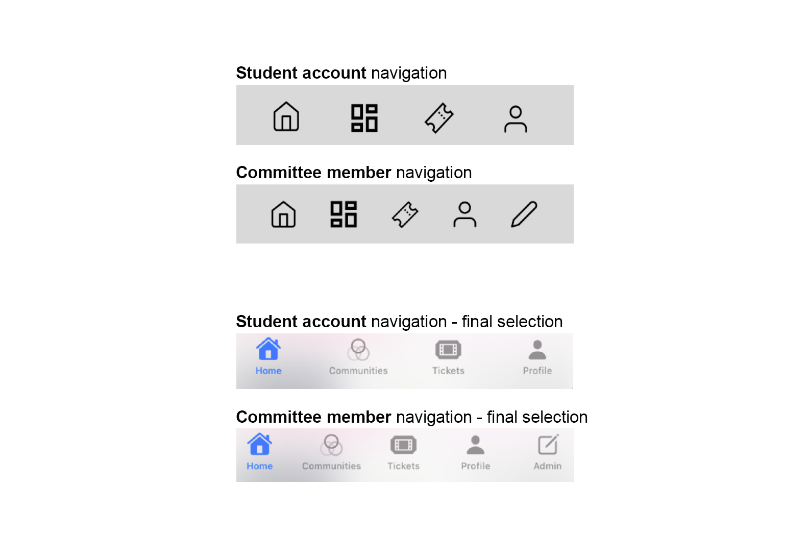
The selection of icons was rather complex, especially when trying to make clear that the committee member had extra functionality within the app. I have used SF icons, which are premade by Apple. The icon for communities changed to interconnected circles to represent unity, and the admin icon changed to a more standardized icon that is used to communicate existing 'edit' abilities
Uniform CTA's (call to action) buttons and headers
Keeping in line with the brand guidelines that were previously defined, I used the main colours to communicate uniformity between buttons that perform an action. The headers are also uniform and communicate their intention clearly. The main purpose is to allow the user to understand easily where things can be clicked.
Outcome
The outcome of this project is an app developed on SwiftUI, written on Swift and coded specifically for IOS devices. The main purpose of this app is to facilitate the management of student societies and sports clubs, as well as engage and connect members and committees under a unique platform.
The app counts with key sections such as in-app ticket purchases, messaging capabilities, society profile and live updates, digital student ID, and an admin dashboard dedicated for those committee members who need to manage their societies. Being a committee member unlocks features such as completing training modules, creating new events, completing health and safety forms, and providing live updates to society members.
Reflection
This project allowed me to develop an end-to-end product, placing emphasis on the user, and implementing ideation and iteration design techniques. On the journey, I also developed an understanding of the SwiftUI coding platform and explored the opportunity to work with an existing body of data owned by the Student Union and UAL. There are still back-end processes that need consideration, such as login validations, student ID, and admin permissions.


